iOS: App Store layout updates

To check out more blog posts about iOS 6, including my introductory one, click here.

Looks like Apple's gearing up for the scheduled release of iOS 6. Some of the webapp-based parts of the App Store on iOS 6 beta 4 is being renovated. And Genius for apps, which was previously "unavailable on iOS 6," can now be enabled, but still doesn't do much.

Homescreen history continues on my iPad

A couple weeks ago, I posted a blog analyzing how I set up my homescreen's icons, how I transitioned from my iPod Touch to my iPhone. I've made another device leap, this time much more diverse. The first thing I did when I got my iPad was put my iPhone right next to it, and arranged icons like they appeared on my iPhone. There were a few problems, though. Before I get to that, let's compare my most up-to-date iPhone homescreen to my iPad's.

iOS 6: Shared Photo Streams

To check out more blog posts about iOS 6, including my introductory one, click here.

In iOS 5, Apple introduced iCloud, and along with it, Photo Stream. Photo Stream is basically a photo syncing feature. If you take a photo on your iPhone, it'll appear on your iPad and on your computer, or on any device you have set up with Photo Stream. You can add a photo to Photo Stream from any device and it'll show up on all your other devices. That's nice and all, but here's why I don't use it: lack of filtering. No matter where the photo came from (saved from a website, received in a text, taken by the device) it's synced to all your devices. No matter what. You can delete photos from Photo Stream, but it'd be really neat if I could choose what photos are in Photo Stream before they're added.

Now, with iOS 6 comes Shared Photo Streams. That's right, Shared Photo Streams. They're essentially albums you create and choose to share with certain people. If you add a photo to that Stream album, it shows up on everyone's devices that you're sharing the Stream with. Then everyone can comment on and "like" the photos in the Stream, like Facebook.

Google Chrome on the iPad vs. all

Before I begin my praise of Google's iOS browser on my iPad, I want to make it known that I haven't actually even tried to use Safari on my iPad. I messed around with it once and just didn't like it. That said, I will be comparing Chrome to Safari, or rather pointing things out that Chrome does better. I'll also probably be referencing Chrome on my iPhone, and a did a rundown of it here, so it's probably a good idea to read through that first. Now, onto Chrome on my iPad.

I've noticed that when comparing a wide variety of things between my iPhone and my computer, there aren't many similarities. It makes sense: the iPhone's screen is much smaller than a computer monitor, so things have to adapt and condense. But when I start comparing things between my iPad and my computer, I begin to see common traits. That makes sense, too. The iPad has much more screen space, like a computer, for information and GUI to be displayed. One common trait is browsers. Safari on the iPad looks a lot like Safari on a computer; a lot more than Safari on an iPhone does, anyway. Google Chrome on the iPad also closely resembles its bigger brother on the computer, and that's something I really like. It isn't a learning experience (however basic) trying to figure out how to use Chrome on the iPad, like it was on the iPhone. Most things are right where they are on the computer version, with some exceptions. I'm going to analyze and rate out of 5 how features are implemented on desktop Chrome, iPad Chrome, and iPad Safari.

iOS 6: iPad favorite features


To check out more blog posts about iOS 6, including my introductory one, click here.

Shortly after getting it, I updated my iPad to iOS 6. I was looking forward to certain features like Siri and the new Clock app. Just like on my iPhone, I'm going to run through my favorite new features in iOS 6 on my iPad.

Clock
Even the icon is a step up from the iPhone’s. The first section, World Clock, has a world map displaying the time and weather in up to 6 places around the globe. A shadow also shows where in the world is dark at the current time.

iOS 6: Updating my iPad

To check out more blog posts about iOS 6, including my introductory one, click here.

I got an iPad, and updated it to iOS 6. I was looking forward to things like Facebook integration in Contacts and Calender, the cool Clock app I had seen screenshots of, and most of all I wanted Siri on my iPad. I did get all those features, and as it turned out, even more that I hadn't heard about.

Just like on my iPhone, after I updated, I got a little setup process.

iPad


A few days ago, I went to Sam’s club to buy an iPad. It was very exciting. Before this, iPads were awesome toys/productivity tools that a ton of my friends seemed to own. To be honest, I didn’t really know what I was going to do with it, but I knew I would have fun with it. Got home, started playing with it, and realized that the microphone wasn't working properly. The next day, it was exchanged for my 3rd gen 16 GB wifi-only iPad on iOS 5.1.1. They first app I downloaded was Google Chrome, and I immediately got to work setting up my home screen of icons (because I'm rather picky with that). Next I downloaded a few more apps I could think of, stopped at Starbucks, and got a free download of Soundhound∞ from their app pick of the week. I was deciding whether to jailbreak it, and eventually went for it. Absinthe hung on “Waiting for reboot...” So, I had to manually reboot it, which was scary. I didn't want to have to restore my new iPad already. It worked fine, though. I started trying out a few tweaks, and wasn't really impressed, so I decided to update to iOS 6. It would be nicer to have everything on my iPhone on my iPad, like Facebook integration and most of all, Siri. So I got my UDID registered and updated (more blogs about that coming soon). It's really cool to see what iOS translates into from my iPhone (“default iOS”) to my iPad. I really like all the design styles that apps use, from multi-column to little pop-up windows for things. It should be a fun time relearning iOS on a larger screen. It's weird going back to using my iPhone, even for a second, after using my iPad. My iPhone seems almost like a tiny little toy. I imagine over time I'll adjust. I'm going to have fun writing more about my new iPad.

Welcome Ty

A couple days ago, I posted a blog about some changes here. One of those changes is a new author joining World of Tech. His name is Ty, and he's going to be writing blog posts here. He's one of the few guys that I know that can keep up with all the tech stuff inside my head, often surpassing it. I think he has a lot to contribute, and I hope everyone will enjoy his content! Welcome, Ty!

Expanding

Very soon, World of my Tech will be experiencing some growth, which means a new name and new URL. Instead of http://cm5womt.blogspot.com, we'll be located at http://worldotech.blogspot.com. And instead of World of my Tech, we'll be called World of Tech. Reason being is that a new author is joining the blog, and the "my" part just doesn't fit for a multi-person blog. There will be a few other changes, so stay tuned. And remember, if nothing is at this domain, it's been moved to http://worldotech.blogspot.com.

We're on Google+!

World of my Tech has a Google+ page! I've started focusing on getting the word out about my blog, and a Google+ page is a good start. Every time a blog is posted, it's shared via the WOMT G+ page. Adding it to a Circle is a quick and easy way to see the latest posts, as well as get some occasional behind-the-scenes info. And don't forget to +1 the page and blog posts!

My homescreen through the years

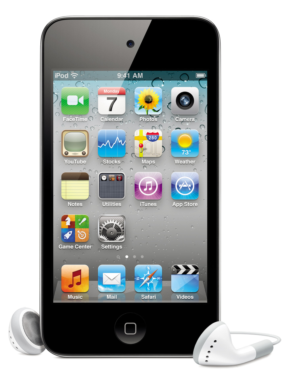
For the longest time, the first page of my homescreen was set up almost completely like what it looked like on a brand new device. I recently dug through all my photos from device backups, computer backups, Dropbox accounts, and anywhere else I could think of that would have screenshots of my homescreen stored away. The oldest image I found was of my iPod's homescreen in December of 2010. If I remember correctly, I got my iPod in late March and jailbroke it for the first time in June. To compare to a "default" homescreen setup, I found this image of a 4th generation iPod Touch. My iPod is a 3rd gen, so it doesn't have a FaceTime or Camera app, but everything else should be about the same.

My initial design was having the Mail app first (where the FaceTime is); leaving the Calendar, Photos, and Contacts (which was by default where the Camera is) apps alone; not messing with the second or third row (the Settings app was next to the Utilities folder, not on the fourth row); and putting 2 frequently used apps on the bottom row, next to Game Center and the App Store. On the dock, I left Music first (or iPod, as a jailbreak tweak turned it into for awhile), Safari second, and 2 folders last. I was almost always jailbroken, so I had 5 icons on my dock. The other app would be iFile (a jailbreak app) and the 2 folders would usually contain my Favorites apps and my Jailbreak apps. This setup, which will be the template for 2 years, 2 devices, and over a dozen iOS updates of homescreens, is shown in my first screenshot.


iOS 6: New stuff in beta 4

To check out more blog posts about iOS 6, including my introductory one, click here.

I finally was able to update to iOS 6 beta 4, and one new feature immediately showed up. When a new iOS device is set up running iOS 5 or higher, it goes through this setup process on the device. It appears that a similar process will occur after updating.

iOS 6: Betas 3 & 4

To check out more blog posts about iOS 6, including my introductory one, click here.

I didn't post anything about iOS 6 beta 3 because it was a very minor update. The changelog included some settings for the Maps app, the foundation for @me.com email addresses to be converted to @icloud.com addresses, and other little things. One I don't like at all is when opening the Passbook app, the brightness setting is changed to 75%. It's supposed to help with showing coupons, card info, etc. that's stored in Passbook even if the screen would have been too dark to make it out. That would be great and all, except the brightness stays at 75% even after exiting Passbook. So, every time you open Passbook, you have to go into Settings and change the brightness back. The build ID for beta 3 is 10A5155d. And just today, beta 4 build 10A5376e was released. Currently, my iPhone cannot even connect to Apple's servers to perform the update, so I can't exactly say what's new (if anything). My guess is that Apple's cleaning up a little before the official release in just over a month. There's always more bugs and back-end problems to fix. 9to5Mac has a rather technical changelog, so you can read through that until some actual UI changes emerge.