Without any tabs open, a very nice splash screen with the Chrome logo is displayed. I'm actually using it as a wallpaper. Let's open a new tab.
The default "new tab" page has 3 sections at the bottom: most visited (& recently closed), bookmarks, and other devices. If you sign into Chrome and enable syncing, all your bookmarks from your desktop browser will be in the bookmarks folder named "Desktop bookmarks." And if you have more than one mobile device with Chrome on it, like an iPod Touch and an iPhone, the Mobile bookmarks folder will be synced between them. It's a very handy feature. The other devices section will show what tabs are open on other devices. For example, if I have tabs with Blogger and YouTube open on my computer and a tab with Amazon open on my iPod Touch, I can see all of those tabs on my iPhone and open them quick. This is an astounding feature with tons of awesome implementations.
Now, lets get browsing!
Chrome has retained its famous omnibox in iOS. It's an address bar and a search bar in one! Also synced over from the desktop Chrome is web history. So, all I typed was "g" and it instantly filled in "oogle.com" for me. It also showed other websites that I visit often that include the letter G. And because Siri diction isn't enough, Google added their Android-style speak-to-type feature. Now onto an actual website
 The GUI is much simpler than Safari's. Instead of a toolbar at the top and the bottom, there's only one at the top. There's back and forward buttons, which appear when applicable. When both are shown, it sorta squishes the omnibox, but it isn't too bad. Next to the omnibox is a drop-down box with a bunch of features, shown below.
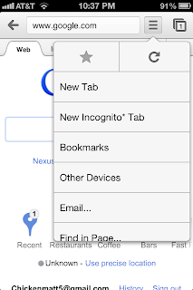
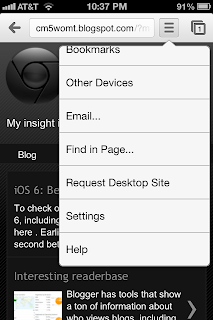
Options include creating a new tab, creating a new incognito* tab, open bookmarks, open other devices' tabs, send an email with the current URL, find in page search, request desktop site, settings, and help. The way Chrome handles tabs is radically different from Safari, and in my opinion much better.
The card-like idea is kept around from Safari, but instead of strictly scrolling from one to another, they're stacked on top of each other. The second screenshot above shows tabs being pushed onto each other. To close tabs, there's the simple X button, or you can more naturally swipe them away.
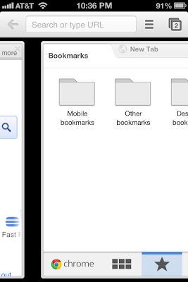
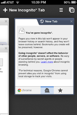
Switching tabs is just as nice and fluent. Instead of tapping the tabs button and swapping tabs, you can slide from side to side. Incognito mode sorta made it to iOS. Wherever its mentioned, it has an asterisk (*) next to it. That just means that because of Apple's restrictions on 3rd party browsers, Chrome cannot stop websites from using local storage to track your visits, even while using Incognito* mode. That really shouldn't be a problem, though. The history still isn't saved. Incognito* tabs are put into their own stack of tabs as well.
Those are just about all the good parts that I've found. It isn't all perfection, however. Certain features that are more or less required in a main browser are missing. First, a list of visited websites: History. Desktop Chrome has it, why didn't it get to iOS? Also, Safari has limited capabilities of downloading files. That's also absent in Chrome, but available (better that Safari) on other browsers from the App Store. Those little flaws aside, Chrome for iOS is a good browser and a pretty big success on my homescreen. It replaced Safari on my dock as I image it did with many others, seeing as it made it to the top #1 free app in the App Store in mere hours after release. I look forward to future updates hopefully improving Chrome.
Options include creating a new tab, creating a new incognito* tab, open bookmarks, open other devices' tabs, send an email with the current URL, find in page search, request desktop site, settings, and help. The way Chrome handles tabs is radically different from Safari, and in my opinion much better.
The card-like idea is kept around from Safari, but instead of strictly scrolling from one to another, they're stacked on top of each other. The second screenshot above shows tabs being pushed onto each other. To close tabs, there's the simple X button, or you can more naturally swipe them away.
Switching tabs is just as nice and fluent. Instead of tapping the tabs button and swapping tabs, you can slide from side to side. Incognito mode sorta made it to iOS. Wherever its mentioned, it has an asterisk (*) next to it. That just means that because of Apple's restrictions on 3rd party browsers, Chrome cannot stop websites from using local storage to track your visits, even while using Incognito* mode. That really shouldn't be a problem, though. The history still isn't saved. Incognito* tabs are put into their own stack of tabs as well.
Those are just about all the good parts that I've found. It isn't all perfection, however. Certain features that are more or less required in a main browser are missing. First, a list of visited websites: History. Desktop Chrome has it, why didn't it get to iOS? Also, Safari has limited capabilities of downloading files. That's also absent in Chrome, but available (better that Safari) on other browsers from the App Store. Those little flaws aside, Chrome for iOS is a good browser and a pretty big success on my homescreen. It replaced Safari on my dock as I image it did with many others, seeing as it made it to the top #1 free app in the App Store in mere hours after release. I look forward to future updates hopefully improving Chrome.

No comments:
Post a Comment