
I've noticed that when comparing a wide variety of things between my iPhone and my computer, there aren't many similarities. It makes sense: the iPhone's screen is much smaller than a computer monitor, so things have to adapt and condense. But when I start comparing things between my iPad and my computer, I begin to see common traits. That makes sense, too. The iPad has much more screen space, like a computer, for information and GUI to be displayed. One common trait is browsers. Safari on the iPad looks a lot like Safari on a computer; a lot more than Safari on an iPhone does, anyway. Google Chrome on the iPad also closely resembles its bigger brother on the computer, and that's something I really like. It isn't a learning experience (however basic) trying to figure out how to use Chrome on the iPad, like it was on the iPhone. Most things are right where they are on the computer version, with some exceptions. I'm going to analyze and rate out of 5 how features are implemented on desktop Chrome, iPad Chrome, and iPad Safari.
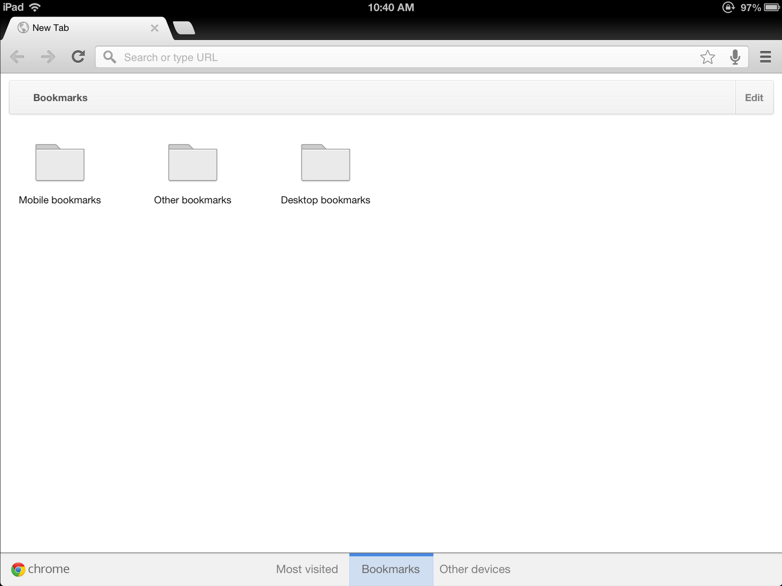
Bookmarks
I find bookmarks very important. They're literally your personal collection of shortcuts to your favorite and memorable places on the vast Internet.
Let's start with the staple, iPad Safari. In Safari, bookmarks are either kept in a bookmarks bar, which is a toolbar that sits between the address bar and the tabs. However, by default, it only appears when a new tab is opened. Also, Safari has a little drop-down menu for all the other bookmarks that aren't on the bookmarks bar. Syncing bookmarks between devices occurs automatically, so my bookmarks on my iPhone and iPad are identical. The bookmarks bar is nice, I suppose, but if it only appears when a new tab is opened, it isn't any easier to get to than opening the tiny box with bookmarks in it. And when I say tiny, I mean it. You can't see more than 5 bookmarks at a time when the keyboard is up, and they're snipped to the size of the menu. For bookmarks, I'm going to give Safari a 3 out of 5.
Next will be desktop Chrome. It, too, has a bookmarks bar and a drop-down menu for bookmarks. Except, the bookmarks bar is always shown, and the drop-down menu can be a big as bookmarks are, not defined to a set size. Bookmark syncing is also present, reflecting changes made to bookmarks from other devices. I rate desktop Chrome a 4 out of 5.
iPad Chrome has a surprising number of differences from desktop Chrome. It does not have a bookmark bar at all. Bookmarks are kept in a section on the new tab page, and they take up the entire screen. Bookmarks from desktop Chrome can be viewed, and there's a separate folder for mobile bookmarks. The lack of a bookmark bar is disappointing, because the iPad definitely has space for it. I'm giving iPad chrome a 3 out of 5.
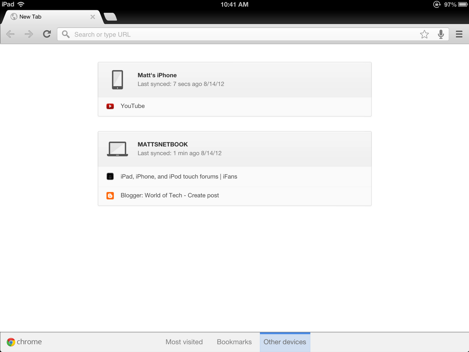
Syncing tabs
Syncing tabs is a more recent popular addition to browsers, and I love it. Being able to leave my desk with a tab open and be able to open it on my iPad or iPhone is great.
On Safari, synced bookmarks exist through the feature dubbed "Cloud Sync." They're sorted by device open on and stored in a set-sized drop-down menu, just like bookmarks. And from my experience, they aren't very up-to-date. Thanks to my hatred of the awful way the drop-down menus are implemented and the lack of functionality, Safari gets a 2 out of 5.
In desktop Chrome, tabs are synced by device open on. They appear on a pop-up menu on the new tab page that, again, fits to the size of the open tab name instead of chopping it off. It takes a few seconds to update new tabs, but never leaves old one around. I give it a 4 out of 5.
iPad Chrome has a similar-but-different method compared to Safari and desktop Chrome. Tabs are synced by device and update accurately after a few seconds. Instead of stored in a menu, the tabs get a full screen section in the new tab page. That's why it gets a 5 our of 5.
Organizing tabs
The way tabs are displayed and organized is also important, especially for multitaskers.
In Safari, tabs hang down from the address bar's toolbar. If there's 1 tab open, it takes up all the space on the tab bar. If there's 2, each gets half the bar. If there's 3, each gets a third. If there's 5, each gets a fifth. It seems like a logical system, until you hit 10, 20, or even more tabs than that. A twentieth of the bar is just obnoxious. Tabs can be dragged around to be reordered. They may only be closed one at a time, with an X appearing on the tab as its selected. Due to its fundamental flaws, Safari gets a 2 out of 5.
Instead of hanging down, desktop Chrome's tabs sit up above the omnibar toolbar, like actual tabs in a filing cabinet. Each tab is the same size, until the tab bar is filled, and then the tabs start resizing to accommodate. But that's only after you reach 7 or 8 tabs, depending on your screen size. They can be reordered by dragging, and an X is always shown on each tab. Desktop Chrome gets a 4 out of 5.
iPad Chrome works very similarly to desktop Chrome. Tabs appear above the omnibar toolbar like file cabinet tabs and can be dragged to be reordered. Each tab is the same size. The big difference, though, is when you have too many tabs to all fit on the screen at once. Instead of down-sizing, tabs begin to stack at one end of the tab bar or another. To see tabs that are stacked on top of each other, sliding across the tab bar unstacks one side and stacks more on the other side. I believe this is superior to crunching down tab sizes, because that actually takes away space to display what the tab actually is. In the stack method, tabs are temporarily hidden and can be re-exposed easily, and each retains the same displayed information that it had before. Also, Xs are always shown on each tab. 5 out of 5 for iPad Chrome.

Text-based navigation fields
That's a fancy way of saying the address bar (where you put it www.google.com) and/or the search bar (where you search Google, Yahoo, or other search website).
Safari has a classic address box and search bar next to it. It isn't bad, but it isn't necessarily good anymore, either. You HAVE TO put URLs into the address bar and you HAVE TO put anything else (most often search queries) into the search bar. When typing into the address box, sites you've visited and bookmarks with similar URLs are displayed in a drop-down menu. When typing in the search box, recent searches, as well as searches similar to what's being typed shown up in a drop-down menu. Basic, normal, nothing special. 3 out of 5.
Desktop Chrome was the first browser to introduce the omnibar, a combination of the address and search boxes. Anything can be put in, and all relevant information is shown in a drop-down menu, from recently visited sites to bookmarks to web searches. And if something is typed a lot, it'll be auto-completed upon beginning to type it. For example, if I go to google.com a lot and type "go," the "ogle.com" will be filled in for me, and all I have to do is hit enter. It works for URLs and searches alike. If I search for "New York weather" a lot and type in "New Y," the "ork weather" will be filled in automatically. Another great feature of the omnibox is syncing of suggestions and other prediction data. If I visit yahoo.com a lot on my iPad and begin typing “yah” on my desktop, the “oo.com” will be filled in, even though I don't ever use Yahoo on my desktop. That works with anything typed into the omnibox. I find it much better than 2 separate boxes, and give it a 5 out of 5.
The omnibox works the same way on iPad Chrome. Same address + search box, same auto-fill-in, same input syncing. If it isn't broken, don't fix it. Another 5 out of 5.
When all calculated, Safari gets a 10 out of 20: 50%, desktop Chrome gets 17 out of 20: 85%, and iPad Chrome also gets 17 out of 20: 85%. I was actually expecting desktop Chrome to come out on top, with iPad Chrome leading slightly behind it. All of this is entirely based on my opinions, however. It's everyone's right to have a preference; this was an explanation of mine.
No comments:
Post a Comment