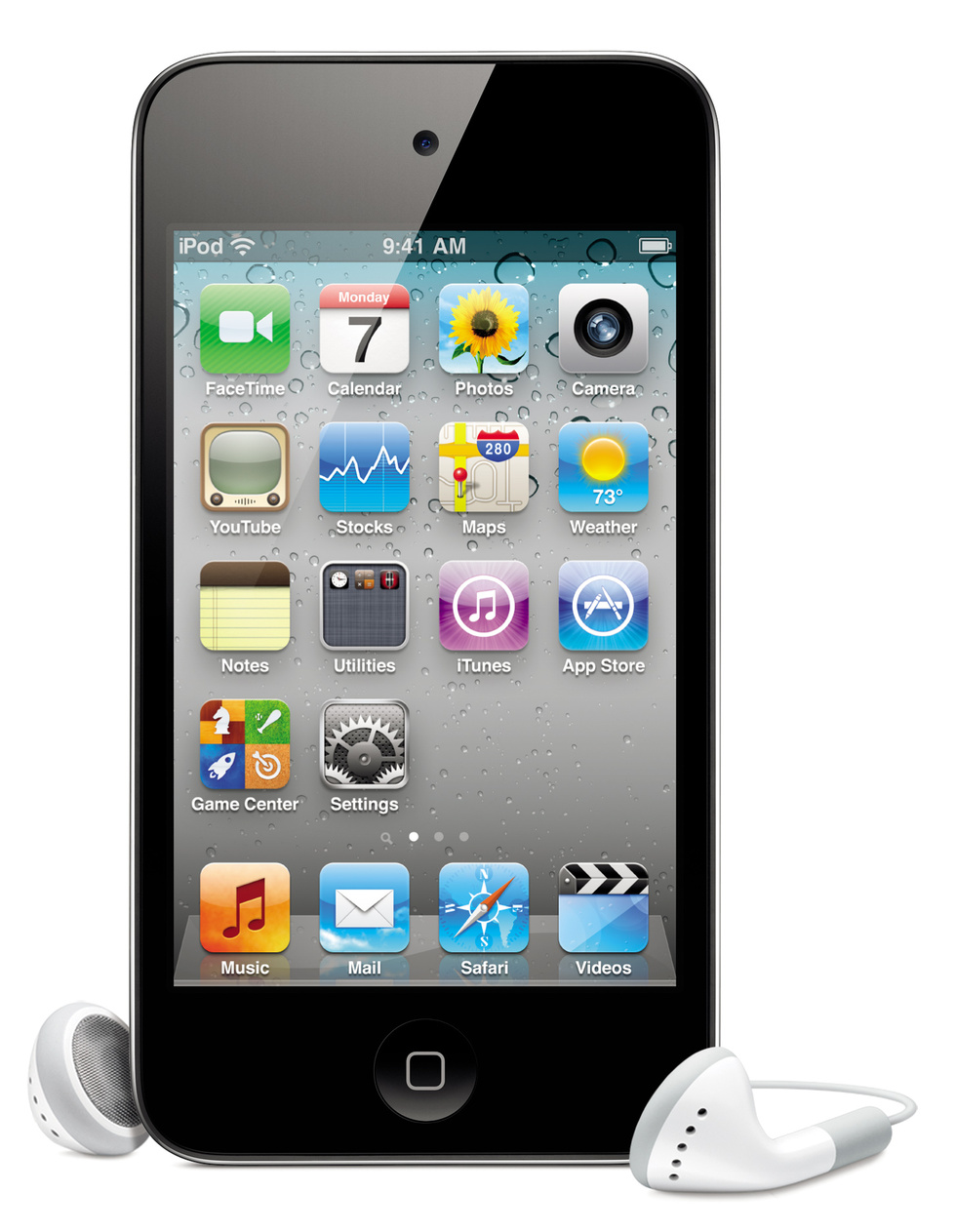
My initial design was having the Mail app first (where the FaceTime is); leaving the Calendar, Photos, and Contacts (which was by default where the Camera is) apps alone; not messing with the second or third row (the Settings app was next to the Utilities folder, not on the fourth row); and putting 2 frequently used apps on the bottom row, next to Game Center and the App Store. On the dock, I left Music first (or iPod, as a jailbreak tweak turned it into for awhile), Safari second, and 2 folders last. I was almost always jailbroken, so I had 5 icons on my dock. The other app would be iFile (a jailbreak app) and the 2 folders would usually contain my Favorites apps and my Jailbreak apps. This setup, which will be the template for 2 years, 2 devices, and over a dozen iOS updates of homescreens, is shown in my first screenshot.
The first screenshot was taken in December 2010. The second was on January 12, 2011. The third was just 9 days later on January 21, 2011. The first shows that my "2 frequently used apps" at the time were Cydia and Infinity Blade. I quickly dropped that design idea, however, in favor of getting rid of the one folder and showing all of Apple's stock apps on my homescreen (as shown in screenshots 2 & 3). Between the first and second, the Calender and Photos apps switched places. And in the third screenshot, I had figured out how to display the Camera app (even though my iPod didn't have a camera), so that replaced my Photos app for awhile. The dock layout stayed about the same throughout the 3 screenshots. The first shows Glasklart, one of my favorite themes, and probably hardest to set up. The theme in the other 2 is Classica, which is my all-time favorite theme.
The first of these 3 was taken on January 25, 2011. The second was in March 2011, and the third was in June 2011. The first 2 match up with the last set's layout, but the third re-introduces the Utilities folder. The reason for its return was because I wanted to have the Photos and the Camera app visible, and then I could throw in another app on the homescreen (which happened to me Orbit). The dock again stayed the same. The first screenshot's theme was again Glasklart, and the other 2's is Classica.
The first of these 3 was taken in October 2011, the second was from November 2011, and the third is from today, August 7, 2012. In the first screenshot, I had just updated to iOS 5, which brought a ton of new Apple apps. Between the last set and this one, the Utilities folder turned into a folder for Apple apps: not only stock ones, but App Store-distributed ones as well. iOS 5 brought iBooks, Reminders, Messages (which I renamed to iMessage), and added support for Find My iOS Device to iPods. I needed somewhere to put all the stock apps that were overflowing from my homescreen first page, as well as a convenient location for all the App Store Apple apps, so the Utilities folder was renamed. Not much changed between these 3 screenshots, with the exception of the dock in the third. Recently, Google released Chrome for iOS, which replaced Safari on my dock. That's the only change I've made to my dock in the 2 years I've had my iPod. The first and third screenshots don't show any theme, and the second shows Classica. Now, with iOS 6, my iPod will stop getting iOS updates, and as it withers into obsolete-ness, the homescreen will likely look exactly like the third screenshot for the rest of its days.
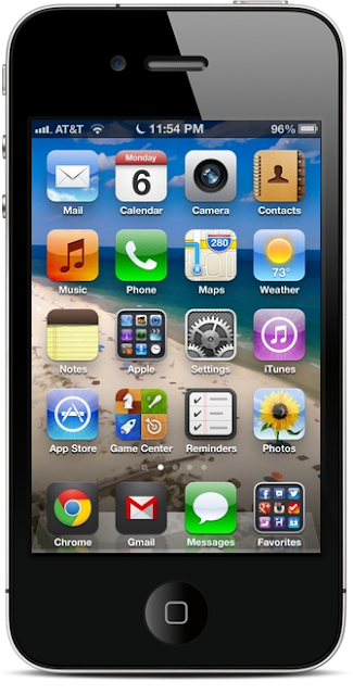
Now onto my iPhone. I got it in October of 2011, and the oldest screenshot I could fine comes from November. Upon referencing my iPod on how to set up my iPhone's homescreen, I noticed that an iPhone has a few more stock apps than an iPod.
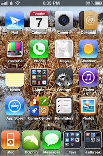
The first screenshot was on November 23, 2011. The second was a week later on November 30, 2011. And the third was in February 2012. For the first time, I had an unjailbreakable iOS device. The first 2 screenshots show just 4 icons on the dock, and I wanted to look a little less stock iOS. So, in the first screenshot, I replaced the Mail app with the then-newly released Gmail app. Very shortly, I got frustrated with Gmail's lack of features (like proper notifications) and put the Mail app back in the second screenshot. Something else that changed from the first to the second was the Photos app being replaced by the Camera app. Taking a hint from my iPod, I kept the Photos app right where I always had it, and put the Camera+ app in the empty space on the fourth row. eventually, I realized that Camera+ was no substitute for the stock Camera app, so I added it to my homescreen. I still really liked Camera+, though, so it stayed until the third screenshot, where it was replaced by the Photos app. An iPhone had the Phone app where the iPod didn't. I never ever touched the Stocks app, so it went into the Apple folder and the Phone app took its place. Without a jailbreak, I didn't have iFile or a Jailbreak folder to put on my dock, so the Messages app took their place. In the third screenshot, I was finally jailbroken. With a jailbreak tweak, I patched in Dolphin as a "default" browser in iOS, so it replaced Safari for a little while on the dock (which had 5 icons again!). The Jailbreak folder was back, except this time, Messages kept the place where iFile would usually go. Music/iPod continued to occupy the first space on my dock. The first 2 screenshots don't have a theme, and the third's is again Classica.
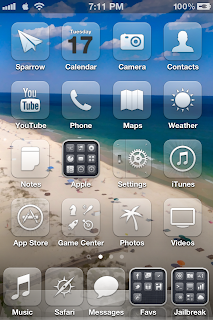
The first screenshot of these 3 was taken in March 2012. The second is from April 17, 2012, and the third is from 2 days later on April 19, 2012. Starting in the first screenshot, I had finally found an app to dethrone Mail: Sparrow. With a few jailbreak tweaks, I was using and loving it much more than the stock Mail app. Safari returned, again sitting second on the dock (where Dolphin did in the last set). Check replaced the Reminders app, which I didn't use a lot anyway. In the second screenshot, the Videos app was added to the homescreen, so Clear was bumped back to my Favs folder. The first screenshot has Classica, the second has Glasklart, and the third has Jaku.
The first of these 2 was taken June 4, 2012, and the second on June 28, 2012. The first keeps my normal layout, while swapping Videos for Any.DO. At the time, I was trying out to-do sort of apps. Reminders and Check weren't feature-filled enough, and Any.DO looked good at the time. The first screenshot would be the last time my iPhone would be jailbroken, because in the next screenshot I was updated to iOS 6. With that update, Reminders got a lot better, so I put it back on the homescreen. Just like on my iPod, Chrome replaced Safari on my dock. Other than the browser, my dock's basic setup has stayed the same since 2010. The homescreen has altered very slightly, but remained more-or-less the same as well. Yesterday, I updated to iOS 6 beta 4 and lost the YouTube app. Suddenly, I had this gap in my homescreen and I had no idea what to put there. At the same time, I rediscovered the Gmail app and how good it actually was (with proper notifications this time) and I wanted to replace my Mail app with it. If you couldn't tell already, I'm very concerned with my homescreen layout, so it was getting difficult.

I chose to, after 2 years, move the Music app to where YouTube was. That meant I had 1 extra space on the dock, and I put Gmail in it. Each of these were huge changes for me. I decided it was finally time to move the Music app because I wasn't using it nearly as often as I once was. When I had my iPod Touch, half of it was iPod and half of it was Touch. I was still using it a lot for music and videos. Now with my iPhone, I use it for a lot more than music, so I didn't think I needed it always available on the dock anymore. I use Chrome (the Internet) more than music anyway. The one drawback I found to swapping out Mail for Gmail is that Gmail only works with my Gmail account (duh) and not my iCloud account. So, for now, Mail will be handling just iCloud, and Gmail will handle Gmail.
This screenshot was taken yesterday, August 6, 2012. It has the frame of an iPhone from http://homescreen.me, a website specifically for uploading and sharing your iOS homescreen. Instead of having to search through years of photos, I'll just be uploading my homescreen screenshots to http://homescreen.me/chickenmatt5 from now on.
If you actually read through this entire thing, I applaud you. I am incredibly picky when it comes to technology, and being able to show years of picky, as well as how my iOS experience has evolved, is really cool to me. Thanks for taking the time to read it. And if you just skimmed through the images, that's good too! That's what I would have done. Remember to keep an eye out on http://homescreen.me/chickenmatt5 for more of my homescreens.


.png)
No comments:
Post a Comment