
To check out more blog posts about iOS 6, including my introductory one, click here.
Do Not Disturb


Maps
Apple threw out Google Maps in favor of their own map data, along with other services' like Tom Tom. It's been a love-hate relationship with the new Maps for me. It isn't nearly as robust as Google Maps. My area doesn't have satellite images yet, and apparently Street View is totally out of the question. That said though, what they improved on is pretty darn cool.
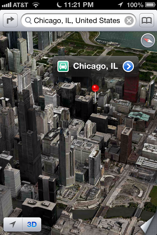

That's the new 3D feature at Navy Pier up top, and to the right is the city of Chicago. Everything is detailed in 3D, so when you move, rotate, or change viewing degrees, everything looks real, even the boats that are docked. Not every area has this, only cities and Apple's HQ at One Infinite Loop.
New app GUI
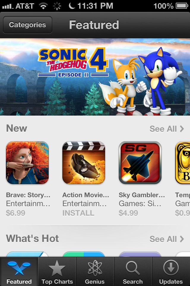
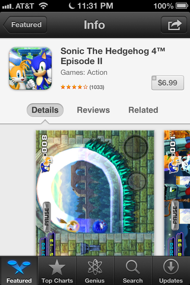
Some apps got a new face in iOS 6, probably most notably the App Store and iTunes apps. It's a very nice change not only to the GUI but to the actual layout of the apps. Here's the App Store.
The iTunes app has a similar redesign, and both apps are looking great and are fun to use too. The Music app has followed the same design pattern shown in the new store apps as well.
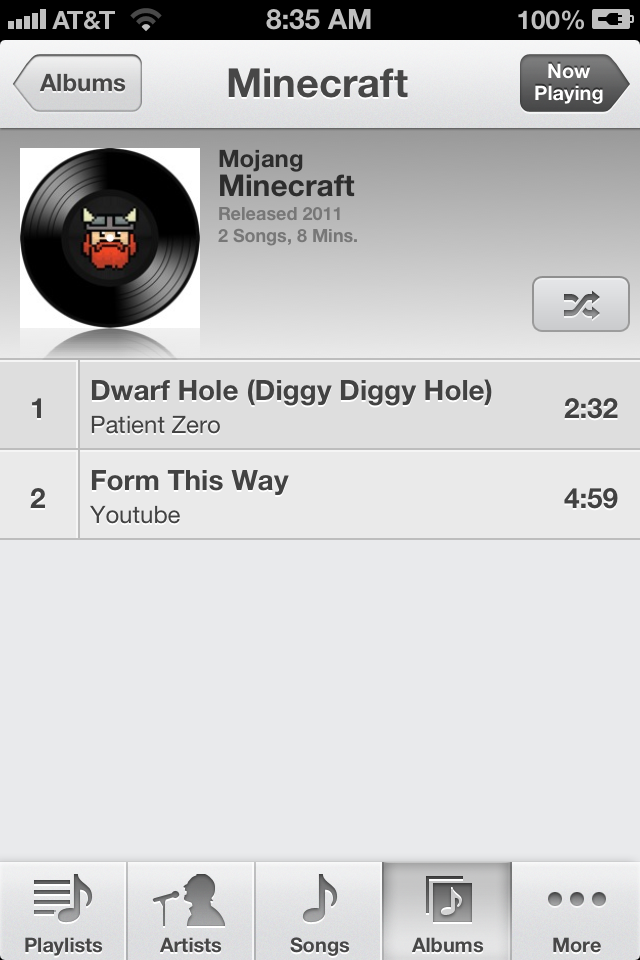
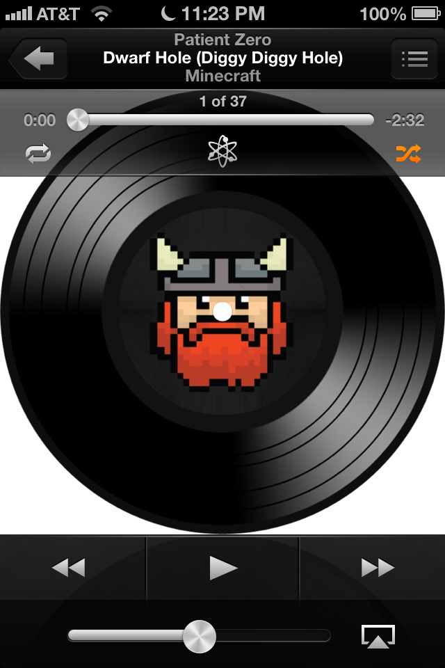
Apple does details very well, and there's no exception in the Music app. See the volume slider, and how it appears to have light reflecting off it? Well, when you tilt your device, that shine actually moves with it. It's really cool to notice.
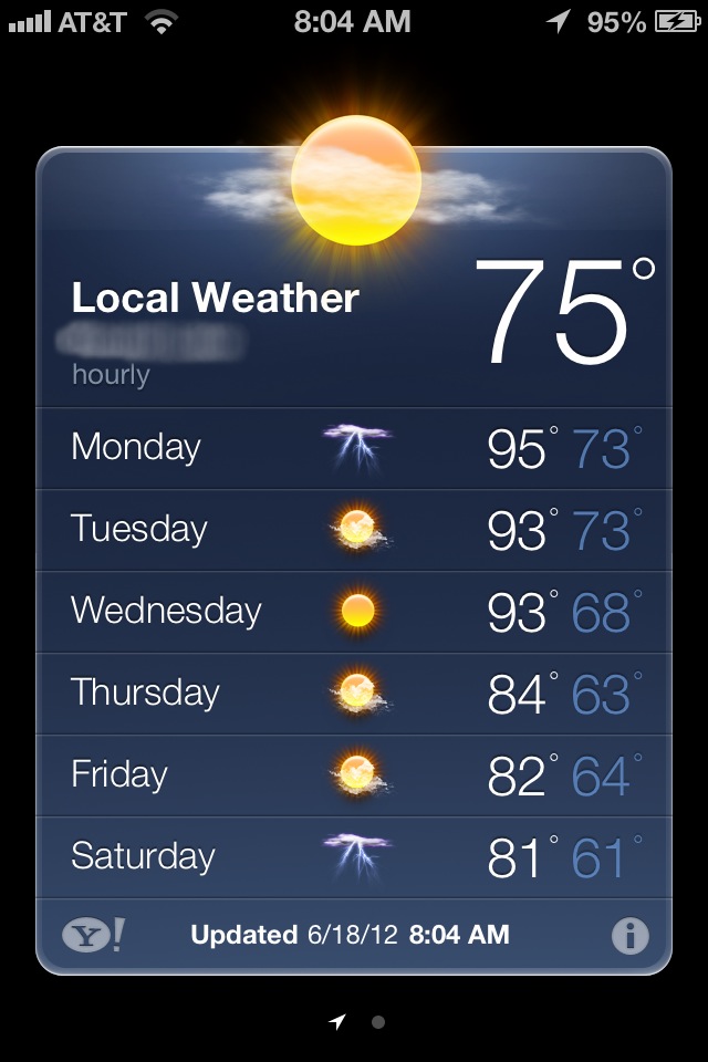
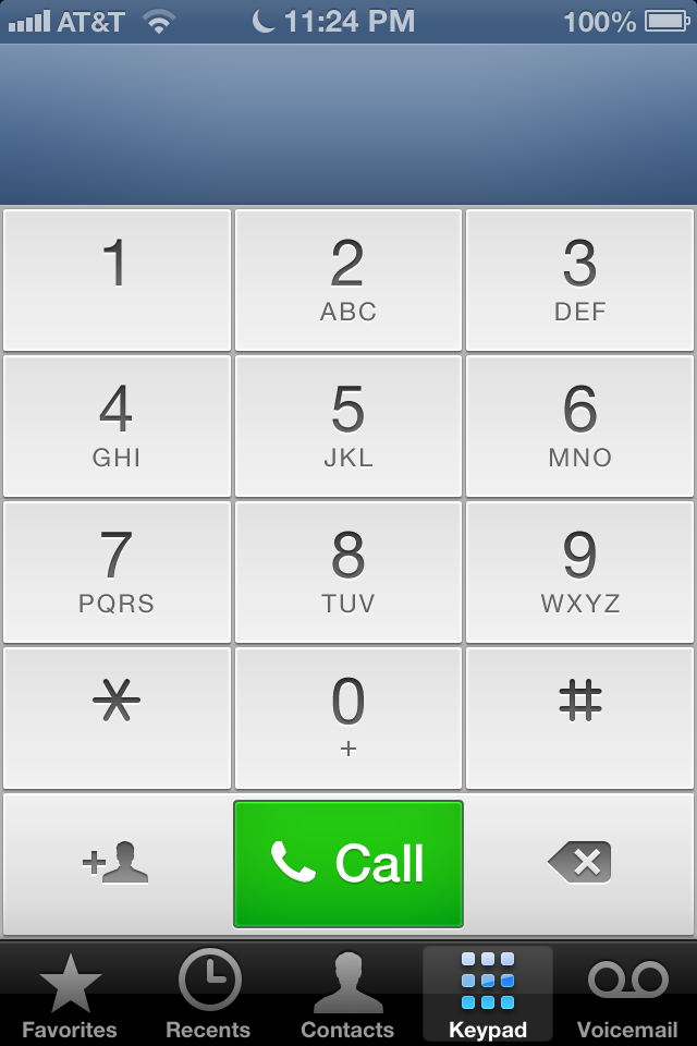 That's the new Weather app, not too much changed, but it's still looking better. The Phone app got a new dialer face, as shown on the left. It looks much more sleek and cool, much like the Weather app. The Camera app, on the right, has a black bar now, instead of silver. Some don't like it, but I do. I think black's less distracting from the photo you're taking.
Safari landscape fullscreen mode
Browsing web pages on such a small screen can be a hassle, and Safari has been improved in iOS 6 to combat that hassle. When in landscape orientation, a new button appears on the toolbar which enables fullscreen mode. The top and bottom toolbars disappear, replaced by transparent back, forward, and disable fullscreen mode buttons. The top toolbar (one with the URL bar and Search bar) is still accessible by tapping towards the top of the screen. It's a really neat new feature.
Dynamic status bar color
Again with Apple's amazing attention to detail comes the status bar improvement. Specifically, the coloring. Before, it was either black, silver, or transparent. Now, the status bar matches the color of the app's top bar color. Here's some examples.

People have figured out that the method used is matching the bottom row of pixels' color, which may not be the best way to do it, but it works, and looks really cool.
And those are my favorite new features of iOS 6 so far.
No comments:
Post a Comment