Chrome Tips 'n Tricks
MINECRAFT 1.8.1
The latest update to Minecraft was released earlier this week: Minecraft Beta 1.8.1, or the “Adventure Update.” It’s called that because everything added is meant to increase the desire to go out and actually explore and do combat; it’s promoting adventuring, basically. Of those additions include a food bar, and sprinting. When you sprint, your food bar depletes. To replenish your food bar, just eat a variety of foods (old and newly added). Also, when the food bar is full, your health is regained over time. Some new food that was added would be watermelons, raw & cooked chicken (from killing a chicken), raw & cooked beef (from killing a cow), and raw flesh (zombies drop it). I wouldn’t eat the last one, though, because it ends up poisoning you and nearly emptying your food bar. Something else that’s new that makes getting some of that new food harder is that passive mobs, like cows and sheep, run away from you when you attack them. Actual combat has been improved: swords can now block by holding down right-click, bows & arrows charge up before firing, critical hits are scored if you hit something while descending from a jump, and mobs drop experience orbs that are collected to fill up an exp. bar. There’s no real use for it for now, says Mojang. Other neat things that were added were iron bars and window panes, vines (in jungle biomes), giant mushrooms, abandoned mines, strongholds, and randomly generated villages. The changed stuff includes lighting (not only from torches, but the day/night transition is much smoother) and how large biomes have to be (so you don’t find a 12x12 desert in the middle of a forest). I can’t play this update on my netbook because it’s too wimpy, but I have been playing at school and have brought back some screenshots:
Step back, Microsoft
Windows 8 (a GameBoy)
Props if you got the title joke. If not, pronounce it. Windows 8 looks like it swallowed a GameBoy or some old portable game system, because IT’S ALL JUST COLORED BOXES! Before I go too much further, I guess I should say that Windows 8 developer preview was released earlier this week. (The developer preview is for developers to start playing around with Windows 8 so they can make programs for it.) From what I’ve seen, I’m not impressed at all. Microsoft has gone and turned Windows 8 into a half-tablet and half-smartphone OS. Thankfully, they did leave the normal Windows environment that the power users all know and love, but it’s been boxed into an “app” and thrown in a corner marked DO NOT TOUCH. Not really, but that’s the way I see it. The desktop as we know it is now an app. That being said, all the features of Windows 7 and before are hidden away in that app, and I sure hope there’s some way to disable that goofy “Start screen” that seems to be Win8’s new flagship feature. That environment is meant either for a tablet device or a smartphone, not a mouse. I’ve seen videos of people trying to navigate the Start screen, along with the new method of application switching and the “charms” menu, using a keyboard and mouse, and it’s pitiful. Microsoft tried to sell Windows 7 (clearly a computer OS) as a tablet OS. Now, they’re trying to sell Windows 8 (tablet-ish OS) as a computer OS. Rubbish. They need what Apple has: a computer OS and a tablet OS. Mac OSX wouldn’t belong on an iPad (it barely belongs on computers), and iOS wouldn’t belong on a computer. I’m not the first person to say that, either, and by far. People have also brought up that Windows is big in the business world. What are business folk going to do with stupid flashy tiles and the like? It isn’t meant for business multitasking at all. If I were someone who’s used Windows all my life for getting things done and not having fun and messing around, I’d figure out how to ditch the Start screen and just stick with the applicationized desktop. I wish that the Start screen would just be an addition instead of a reworking of the main UI. Microsoft has gotten a little bit of work done on the desktop, however. Task Manager has been upgraded into something a normal user might understand (if a normal user manages to find their way to the desktop and launch Task Manager). The ribbon UI has been added to Explorer, as well. I wasn’t a big fan of the ribbons at first, but they’ve grown on me. Apparently, IE10 on the desktop is supposed to be better, but I heard that about IE9 and wanted to physically shoot the icon off my desktop. I really hope that Microsoft figures out a way to turn Windows 8 into a respectable, usable computer OS.
Some new blogging tools
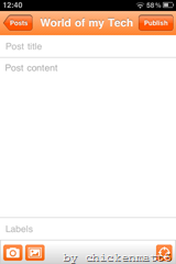
As I mentioned on my normal blog recently, I’ve got some new blogging tools! I’ll try to make this as review-y yet enjoyable as possible. First is Google’s official Blogger app for the iOS App Store. Lots of people, including myself, had been waiting for just this app. To start off, the UI is Blogger-orange, which can get to be a little bit overpowering. 
